
Stand Up!
Client: Dosa SAC
Role: Digital Designer
Year: 2017
Stand Up was an energy drink produced by DOSA S.A.C., a company dedicated to the sale of energy and sports drinks within the Peruvian market.
Project Goals
Redesign of the product's logo and packaging, aimed at updating its visual language. The new proposal aims for a modern, youthful aesthetic to improve its competitive positioning in the market.
I decided to keep green as the main color but change it to a more cryomatic, less neon tone and remove the red. This was because it was the only product on the market focused on this color, thus standing out from the competition.


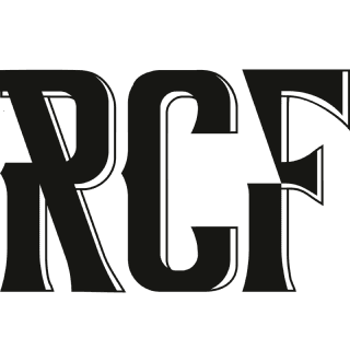
The rooster logotype was eliminated, and the logo concept was redefined entirely. I sought to visually represent the meaning of the brand name by designing the fonts in the shape of an upward arrow and adding details along the edges to create depth and dynamism.

When designing the packaging, the key was to define a structure that would allow for clear reading of the nutritional information, ingredients, and other relevant information. I also decided to incorporate white as a visual element to counterbalance the predominance of green and avoid saturation, thereby achieving a more balanced and legible composition.
I was given creative freedom for the packaging design, which allowed me to lean toward character illustrations and lightning bolts as a narrative device to convey energy. At the same time, I sought to create a deliberately rebellious and exaggerated aesthetic that broke with convention and gave the product visual character.


