
Pizza Hut
Client: Pizza Hut
Role: Brand Designer
Year: 2021
Pizza Hut is an American restaurant chain and international franchise founded in 1958. Known for its diverse menu, which includes a variety of crusts, appetizers, and desserts, it has become one of the largest pizza chains in the world.
Project Goals
Design of branding and promotional materials in multiple formats, adhering to the brand manual guidelines and ensuring visual consistency. Each piece must meet the campaign's communication objectives, providing clarity, impact, and strategic alignment.
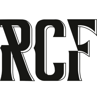
Principal Typeface
PIZZA HUT
Print/Digital Typeface Choices
Sharp Sans Display No1
EXTRABOLD
Sharp Sans Display No1
EXTRABOLD
Sharp Sans Display No1
EXTRABOLD
KNOCKOUT
49 LITEWEIGHT

CMYK 2/100/85/6
RGB 200/16/46
HEX #C8102E
Pizza Hut Red is used for the logo and as an accent color.
CMYK 13/8/11/26
RGB 178/ 180/178
HEX #b2b4b2
Concrete grey is the solid color version of Concrete texture. Is used sparingly.
CMYK 0/0/0/100
RGB 35/31/32
HEX #231F20
Black is used sparingly ad an accent and to break the Pizza Hut red color.

The project required the exclusive use of graphic resources from the brand's internal database, including images, vectors, icons, and shapes. My involvement focused on the layout and design of the pieces, without modifying or altering the preexisting visual elements. The main challenge was organizing large volumes of information into limited areas, ensuring legibility and communicative efficiency.


To achieve visually diverse pieces, various forms of graphic experimentation were employed through the creative use of typefaces and shapes. This strategy allowed for dynamic composition and expanded the graphic possibilities within the visual system.


The brief stipulated that the pizza should occupy at least 70% of the visual area, as it was the central communication element. Additionally, the official wood texture, provided by the client, was required for the backgrounds as part of the graphic identity guidelines.


A variety of social media content was developed, with a primary focus on Facebook.
For the graphic pieces, the client granted greater creative freedom, allowing for the incorporation of additional visual elements (specific to the brand) aligned with current promotional campaigns.


